Jelle Kuiper
A theater producer and marriage officiant

About Jelle
Jelle is a versatile public speaker. He officiates weddings and provides comic relief during business conferences. Besides that, he also produces theater shows.
Problem
The challenge was to create a website that shows the right information for each of his different target audiences, while keeping the same overall style.
Solution
To get the creative juices flowing, I presented websites of Jelle’s competitors and different styles of websites to him in our first meeting. He commented on what he liked and disliked and shared what he thought was important on his website. Together we formulated 5 requirements.
1. Clearly show and explain that there are three different services Jelle is offering
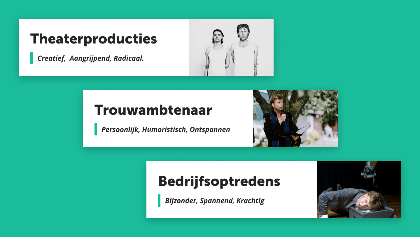
To show the way he takes on different services, I chose to show his main characteristics as USP’s at each job section. This makes the site feel more personal and convinces people to hire him for each specific job. Also, that way people understand that the weddings Jelle officiates (which are described as: personal, humorous, relaxed) have a different feeling to them than the plays he produces (which are described as: creative, touching, radical).

2. Make sure the detailpages stand on their own
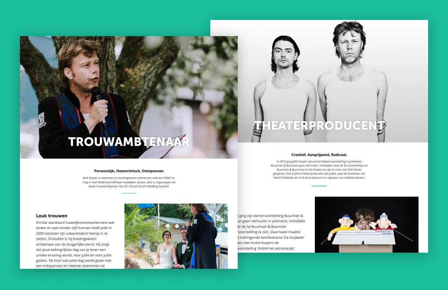
Based on data from Jelle's previous website, a lot of people come to his site directed from wedding and corporate speaker sites. These are people who are often interested in one specific service that is offered. This means the detail pages should explain everything they need to know about Jelle and what he’s offering without needing to see the homepage.

3. Give a small taste of other services I’m offering on the detail pages to show my wider skillset
Previously, Jelle has had referrals to officiate a wedding after having done a speech at a conference. This is why it was important to let people from one target audience know what else is offered.
4. Give a sense of trust to convince people Jelle is good at what he does
After explaining what it actually is that Jelle does, it’s important to build some extra trust before showing a contact form. That’s why a slider with positive testimonials and a section with impressive statistics are on almost every detailpage.
5. Make it easy for people to get in contact
The main goal of the website is for people to get in contact with Jelle to hire him. That’s why there is a contact form on every page. Because they are at the bottom of the page, a button was added to the main navigation that really stands out. This way it’s always within reach.
My role
In this project I was the project manager and overall designer. Together with another developer we brought my ideas to life.
Website
The live version of this website can be found here.